

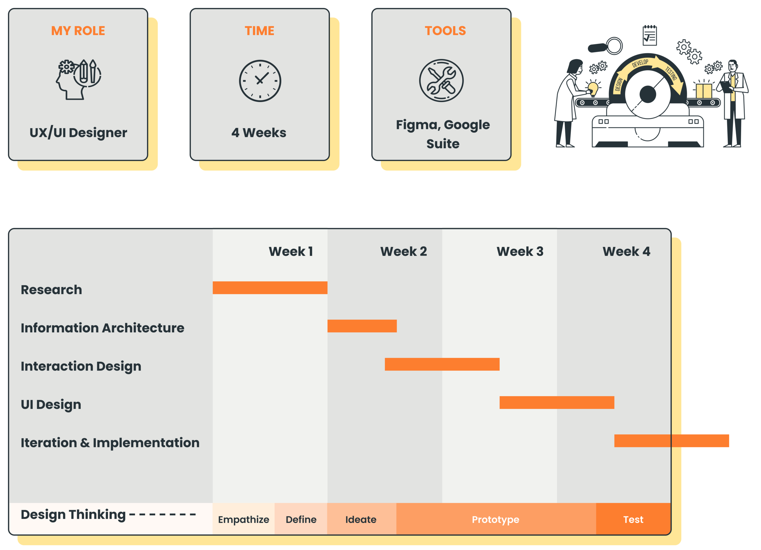
HEADSPACE
Adding New Features

INTRODUCTION
Headspace is a guided meditation application that is dedicated to improving the health and happiness of people all over the world through mindfulness approach. The pandemic has led to a surge in downloads of mental wellness apps and many such apps are being brought to the market often. To remain competitive and at the same time cater to a wider range of users, Headspace would like to expand and show dedication by introducing a new implementable feature to facilitate users in their mindfulness journeys
GOALS
Understand the current experience of the app and research on how the user experience could be improved.
Based on the research, develop one implementable feature that could offer added value to the users and the company.
CONSTRAINTS
Since it is a highly established brand, rebranding is out of the question.
Follow the existing design guidelines.
According to the scope, the design could be focused on the device of your choice - iOS app (mobile version)
The project must be completed in 80 hours.
PROJECT SCOPE
PROBLEMS
Problem 1 - The results of meditation are not instant. Mindfulness is a habit /process and the benefits are long-term based.
How might we help the users to understand their progress over a period of time of how meditation sessions have benefited them to keep the motivation alive and remain consistent in their journey ?
Problem 2 - Meditation is not an easy task, especially for beginners. The mind tends to wander every time it loses focus. It is even harder during difficult times. The silence during the headspace sessions is a discomfort for some users.
How might we help the users to have a more enhanced immersive experience of a session and staying focussed along the way ?
SNAPSHOT OF THE SOLUTION
Solution 1 - “Journal,” provides a quick self-reflection on your current state-of-mind while tracking the evolution of your emotional state.
Solution 2 - “Background Music,” helps the users to have a more enhanced overall experience of a session and staying focussed and calm along the way.

Following is my design process that has been implemented to define the above mentioned problems and derive those solutions.
EMPATHIZE
RESEARCH
The following methods were particularly planned based on the goals and how they could be achieved.
Competitive analysis : Identify and evaluate 2-3 top meditation and mindfulness apps, especially focus on mobile versions.
User Interviews (Qualitative research method) : Conduct 3 to 4 individual interviews virtually through video calls to gain some personal in depth insights.
COMPETITIVE ANALYSIS

USER INTERVIEWS
I started the interviews with a few general questions, and found that all participants felt the Headspace app is easy and pleasant to use, and has visually striking design elements. Each user found themselves interested in meditation for different reasons, and similarly most had different reasons for using the app and different features they liked most.
“I like the design of the app and think it’s pretty user friendly. And I love the voice of the Australian man who leads some of the meditations but sometimes I wish it had some background music.”
— User 3
“I like that they have topic-based things and not just general stuff…I mostly use the burnout ones and the stress and pain ones as well.”
— User 1
DEFINE
PERSONA
The Persona was created with the goal of implementing the new features, while considering the previous research and data from the interviews I’d conducted. My persona, Rahul, existed to help me through the rest of the process.

IDEATE
SITE MAP
The updated sitemap shows where the new features have been integrated in the IA and what things have been eliminated.

DESIGN
WIREFRAMES
Hand sketched low-fidelity wireframes to help me solidify the structure of the pages and its components without the distraction of visual design.

MID-FIDELITY WIREFRAMES
These wireframes show the main UI Design of the Feature pages. These are designed following all the core brand UI guides. This is another phase where major changes could be made in the structure and layout of the page design.

UI DESIGN / HIGH FIDELITY PROTOTYPE
New Feature page designs with the complete brand guidelines and aesthetics including colors, typography, custom illustrations etc.

PROTOTYPE & TEST
USABILITY TEST
The next step was to test the prototype with 3-5 existing headspace users.
Test Objectives
Test if the users are able to use the newly added features seamlessly and if they are able to complete the given tasks easily or not. (Music Feature & Journal Feature)
Test if the users are able to easily locate the Journal feature and if the IA makes sense.
Understand if the new features added any value to the users and how it affects them.
PRIORITY REVISIONS
Sometimes the background music could be distracting, which is why the mute button was provided but the users expressed how having control over the volume of the background music made more sense instead of completely muting it.

Another flaw noticed was that the users were not able to identify the colors of the various moods in the Calendar page without the help of labels.
NEXT STEPS


CONCLUSION
Overall, I enjoyed the process of building off of Headspace’s simplistic, modern and playful design elements. Integrating the music and journal feature was a challenging but rewarding experience. This was the project in which my illustration skills could outshine and I would definitely love to work on more similar projects in future.
Thank you for your time.