

Tennessee Medicine
& Pediatrics
Responsive Health Care Website
(UX/UI Redesign)

INTRODUCTION
Tennessee Medicine and Pediatrics is a medical group practice located in Smyrna,TN that specializes in Pediatrics and Internal Medicine. The practice was founded by Dr.Matthew L. Perkins, M.D. in 2000 with the goal of providing comprehensive healthcare across all age groups. With over 20 years of experience, TN Medicine and Pediatrics continues to provide a lifetime of care to the families in the community.
CHALLENGE
The client’s (www.tnmedpeds.com) website was created 20 years ago, since then only the content has changed, and it is managed with apparently very limited resources. The design patterns are outdated. Overall, the current look of the homepage does not attract new patients or serve as a trust creating factor during the first-impression.
GOAL
Updating the old existing site to a new fully responsive and intuitive medical website which is easy to navigate and design the pages with clutter-free content.
Revamping the aesthetics of the brand to a sleek and modern feel.
The website would mainly focus on the basic information of their facility, the practicing physicians and nurse practitioners, booking appointments, forms and guidelines for patients to help set expectations, articles, testimonials and contact information.
CONSTRAINTS
The Logo must remain the same but open to new color scheme.
The MVP must be completed in 80 hours.
PROJECT SCOPE
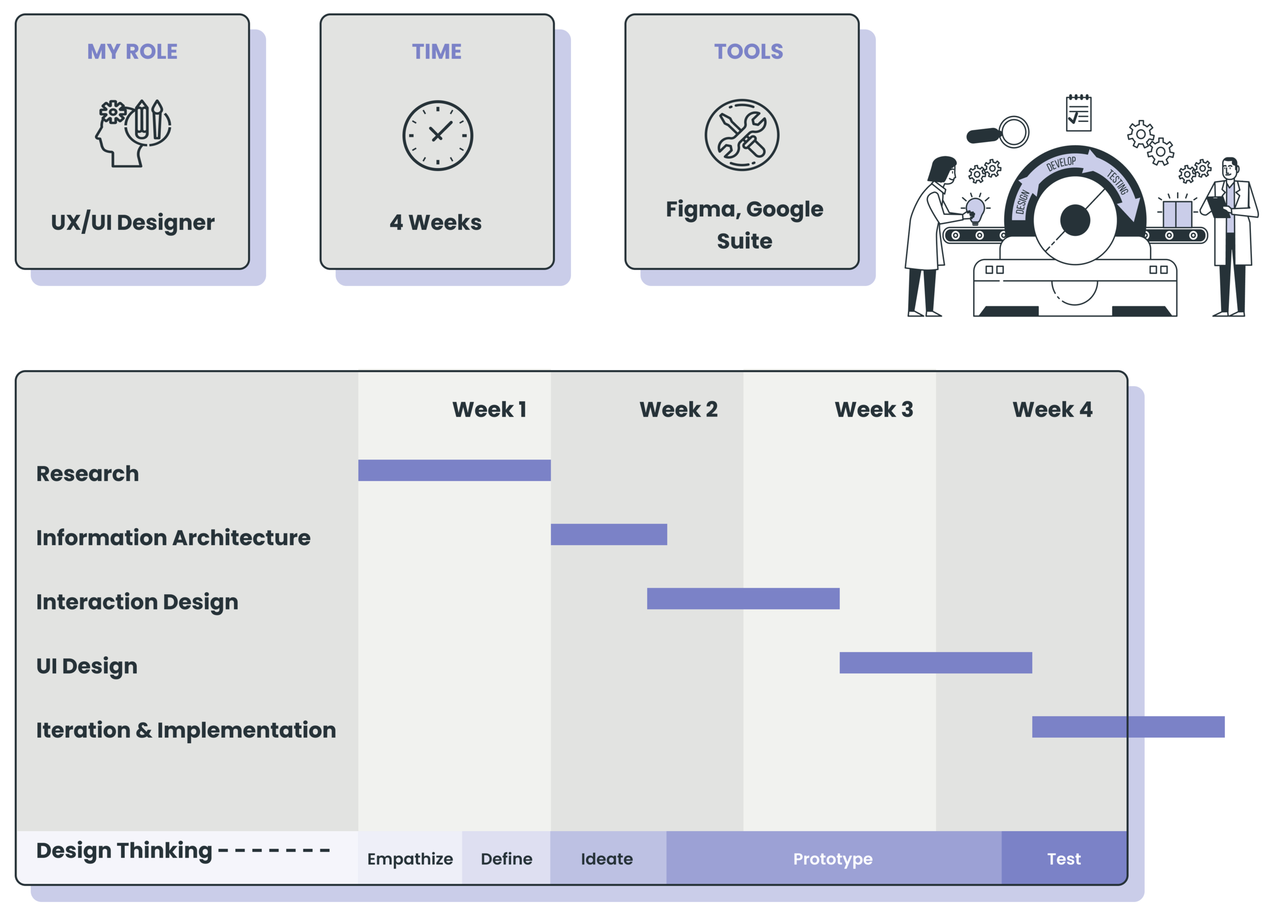
EMPATHIZE
RESEARCH
To determine the redesign goals, first I got to know the website, the client and the users (& their needs). During this part of the process, I applied the following research methods.
Heuristic Evaluation
Competitive Analysis
User Interviews
HEURISTIC EVALUATION
Using the usability guidelines, I went through the existing website, tried to analyze and evaluate the overall design and structure of the website. Finally, I tried to summarize all the findings.
Have a look at some of the key issues on landing page : -

COMPETITIVE ANALYSIS
To identify the interface solutions that are widely used on healthcare websites, I looked at more than 20 websites across the USA and organized the patterns for each main sections of the website (like homepage header, body and footer and other key pages).
The following are some of the strengths & weaknesses from the competitor websites :-

USER INTERVIEWS
After identifying who can be a representative participant - Young Parents , I defined a set of questions.
I interviewed 4 parents who have young children. Thanks to the interviews, a typical user attitude could be spotted.

DEFINE
PERSONA
Meet the user, Kristen Lee.

DEFINING THE GOALS
After analyzing the information we gathered during the research, here are the main goals defined.

IDEATE
SITE MAP
Since, the existing site navigation was very flat and had no logical order, I created a new sitemap from scratch incorporating few existing pages and then adding new important additional aspects that were defined.

USER FLOW
A User flow was created to understand one of the main functions of the website - Booking an online appointment

DESIGN
SKETCHES
Hand sketching few options of landing page designs, highlighting all the necessary sections and CTAs helped me further organize the content.

MID-FIDELITY WIREFRAMES

BRANDING
The major changes in branding were made to the over all color scheme, typography and style - Refreshing, modern, sleek & minimal design to adhere credibility.
Aesthetic Usability Effect
“ It refers to the user’s tendency to perceive attractive products as more usable. People tend to believe that things that look better will work better — even if they aren’t actually more effective or efficient. “
COLORS
The old design uses the traditional blue + white scheme (a safe option for healthcare websites) that is associated with credibility, trust, cleanliness, calm, among a number of other things. But the major pitfall is that blue has been over used in this industry and it is high time to break away from blue to stand out among the competitors.
I retained the aqua green and replaced the blues with purples and added a hint of contrasting yellow that works well with the pediatric element of the organization.


UI DESIGN - DESKTOP

UI DESIGN - MOBILE

PROTOTYPE & TEST
PROTOTYPE
A high-fidelity prototype was created in figma, ready for testing the actual users.
USABILITY TEST
Test Objectives
Test the overall usability, the ease of navigation throughout the site.
Test the amount of effort and time taken to complete the main tasks of the website.
Test if it is easy to locate all the necessary information required.
Find out an overall impression of the branding and look of the site and if at all that affects their task.
The users could easily navigate throughout the prototype without and completed the tasks without any errors or frustrations.
PRIORITY REVISIONS

NEXT STEPS


CONCLUSION
Redesigning and updating an existing website was a challenging task. In this process, I had learnt how to analyze the old design, identify priorities and defining completely new goals based on current user needs. The redesign not only enhances the user experience but it also benefits the Hospital in attracting the right visitors and maintaining their trust.
Thank you for your time.